Backtesting a dividend-safety screen against real dividend cuts
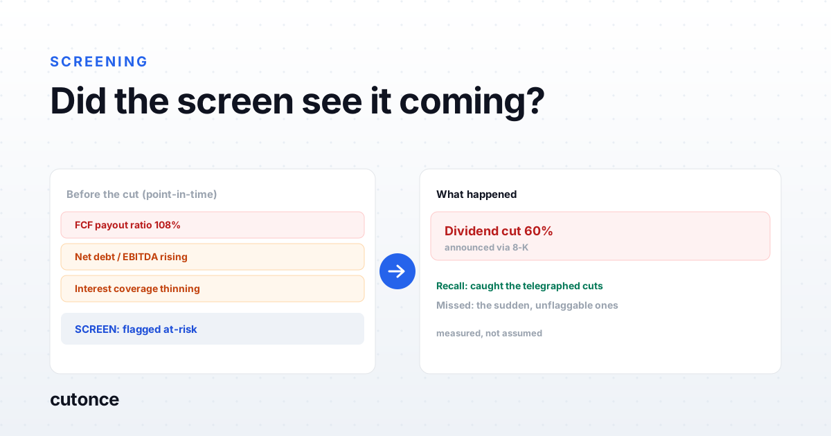
- A dividend-safety screen is a claim, and the way to test it is against ground truth: companies that actually cut or suspended their dividend. Reconstruct each one's metrics as of before the cut and check whether the screen flagged it.
- Measure two things, not one. Recall - what fraction of real cutters the screen caught - and the false-positive rate - how many flagged names never cut. A screen that flags everyone catches every cut and is useless.
- Some cuts are unflaggable. A dividend killed by a sudden shock, an acquisition, or a strategic reset was not telegraphed in the financials. The realistic goal is to catch the financially-telegraphed cuts and accept that the black-swan ones will be missed.
- The result that matters is a screen you can run forward on today's universe. Validation against history is what earns the right to trust the forward-looking flags.
Any dividend-safety screen is a claim: these payouts are at risk, those are safe. The claim is cheap to make and rarely tested, because testing it is more work than building it. But the test is the whole point - a screen you have not checked against reality is just a set of thresholds that felt reasonable. The honest way to check a dividend-safety screen is to run it against ground truth: companies that actually cut or suspended their dividend, measured by whether the screen would have flagged them before it happened. Here is how to do that, what to measure, and why a good screen still misses some cuts on purpose.
Test against what actually happened
Start from the events, not the screen. Assemble a set of real dividend cuts and suspensions with the date each was announced. For every one, reconstruct the company's safety metrics as of a window before that date - a quarter or two ahead, using only the data that was public at the time. Then run your screen on those point-in-time numbers and ask the only question that matters: would it have flagged this name before the cut?
This is the opposite of the usual approach, which is to build a screen on current data and eyeball whether the names it flags "look risky." That proves nothing. Grounding the test in cuts that genuinely occurred is what turns a plausible-sounding screen into one with a measured hit rate.
Measure recall and false positives, not just hits
A screen that flags every company with a dividend catches every cut and is worthless. So one number is never enough. Measure two:
| Measure | The question it answers |
|---|---|
| Recall | Of the companies that actually cut, what fraction did the screen flag beforehand? Low recall means it misses real trouble. |
| False-positive rate | Of the companies the screen flagged, how many never cut? A high rate means it cries wolf and you will learn to ignore it. |
The two trade off against each other, and where you want to sit depends on the cost of each error. For a screen whose job is to pull names into a manual review queue, you can tolerate a higher false-positive rate to buy recall. For one that drives an automated decision, you cannot. Deciding that tradeoff deliberately is the difference between a screen and a guess.
What actually telegraphs a cut
The cuts a screen can catch are the ones a company backed into over several quarters, and they show up in a familiar cluster: a free-cash-flow payout ratio creeping toward or past one hundred percent, rising leverage and thinning interest coverage, earnings that are deteriorating or simply too volatile to support a fixed payout, and distress language starting to appear in the filings. No single one is decisive - a high payout ratio is normal for some business models - which is why the screen combines them. The qualitative half of that, the language in the filings, is the same kind of signal covered in how to screen a 10-K for red flags.
The cuts no screen can catch
Be honest about the ceiling. A dividend suspended because demand collapsed in a quarter, because the company made a large acquisition, because a regulator forced it, or because a new management team decided to redirect capital was not the end of a visible financial slide. Those cuts were not in the numbers beforehand, and a screen that claims to have caught them is either lucky or overfit to the specific history you tested on. The realistic and defensible goal is to catch the telegraphed cuts - the ones with a paper trail - and to accept that the sudden ones are outside what fundamentals can predict.
The two ways the backtest lies
- Look-ahead bias. Using restated financials, or numbers that were only filed after the cut, lets the screen see information no one had at the time. Always reconstruct from point-in-time data.
- Survivorship. Testing only on companies that still exist silently drops the cutters that were later acquired or delisted - often the worst cases. The set of cut events has to include the names that are gone.
Both flaws push the measured performance up, which is why a dividend backtest that looks too good usually is. The general form of this problem - a screen that shines in the test and disappoints live - is the subject of why backtested screens fail live, and dividend screens are a textbook case.
Running it as a pipeline
The payoff is a screen you trust enough to run forward. In Cutonce the validated screen becomes a scheduled pipeline: a data node pulls payout, coverage, leverage, and earnings-stability metrics for the universe, the screen scores each name for dividend risk, and the at-risk names land in a ranked list in a sheet or Slack. Going forward, the actual cuts when they happen are announced in filings, so pairing the screen with 8-K monitoring closes the loop: the screen flags the risk ahead of time, and the 8-K feed confirms the outcome, which is also how you keep extending the validation set.
The result is not a promise that a dividend is safe. It is a measured, honest first pass that concentrates your attention on the payouts most likely to be in trouble, with a known hit rate rather than a hopeful one.
Note: this is not investment advice. A dividend-safety screen produces a probability-weighted watchlist, not a guarantee, and it cannot predict cuts that were never visible in the fundamentals. Verify any name against its current filings and your own analysis before acting on it.
Frequently asked
How do you backtest a dividend-safety screen? Assemble a set of historical dividend cuts and suspensions with their announcement dates, then for each company reconstruct the safety metrics - free-cash-flow payout ratio, leverage, coverage, earnings stability - as of a window before the cut, using only data that was available at that time. Run the screen on those point-in-time numbers and measure how many of the real cutters it flagged, and how many companies it flagged that never cut. That gives you recall and a false-positive rate rather than a vague sense that it works.
What metrics predict a dividend cut? The financially-telegraphed cuts usually show up in a high free-cash-flow payout ratio (the dividend eating most or all of free cash flow), rising leverage and weak interest coverage, deteriorating or volatile earnings, and distress language in the filings. No single metric is decisive; the screen combines them. The important caveat is that these catch the cuts a company backed into over several quarters, not the ones caused by a sudden external shock.
Why do some dividend cuts get missed by any screen? Because they were not visible in the numbers beforehand. A dividend suspended because of a sudden demand collapse, a large acquisition, a regulatory event, or a new management team's strategic reset was not the endpoint of a slow financial deterioration a screen could see. Those cuts are genuinely unpredictable from fundamentals, and a screen that claims to catch them is overfit. The honest measure is how well it catches the telegraphed ones.
What is the biggest pitfall when backtesting a dividend screen? Look-ahead bias, in two forms. Using financial data that was restated or only published after the cut, so the screen 'sees' numbers no one had at the time; and testing only on companies that still exist, which quietly drops the cutters that were acquired or delisted. Both make the screen look far better than it is. Point-in-time data and a survivorship-free set of cut events are what make the test honest.